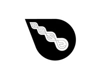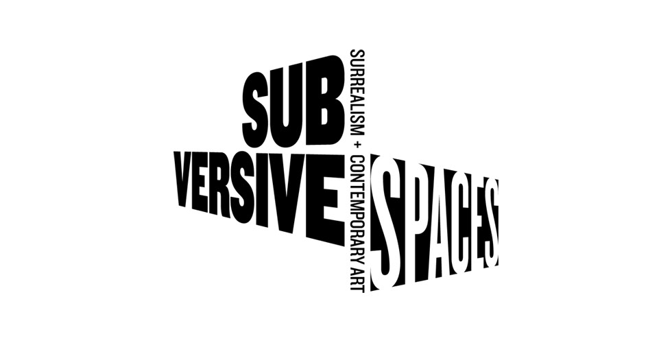
Through research into the work in the show and the artists featured we discovered that a lot of the pieces were intended to provoke thought in the viewer and appear awkward. We built on this theme and produced a strong typographic logotype that used three different planes of perspective and both positive and negative type.