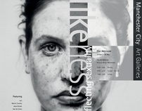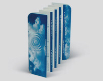
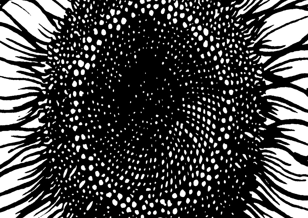
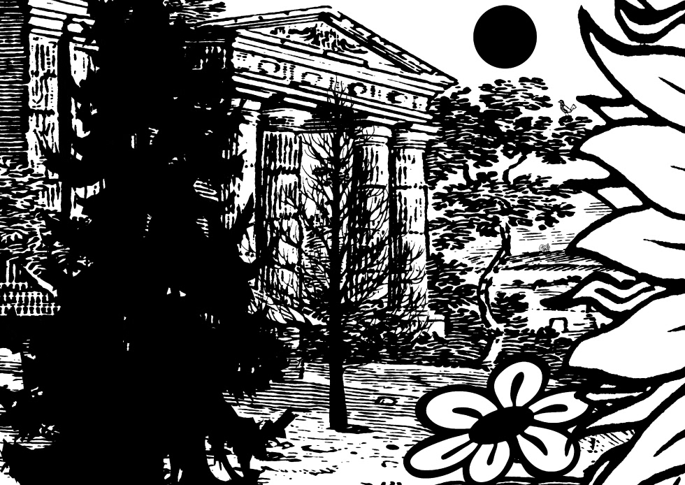
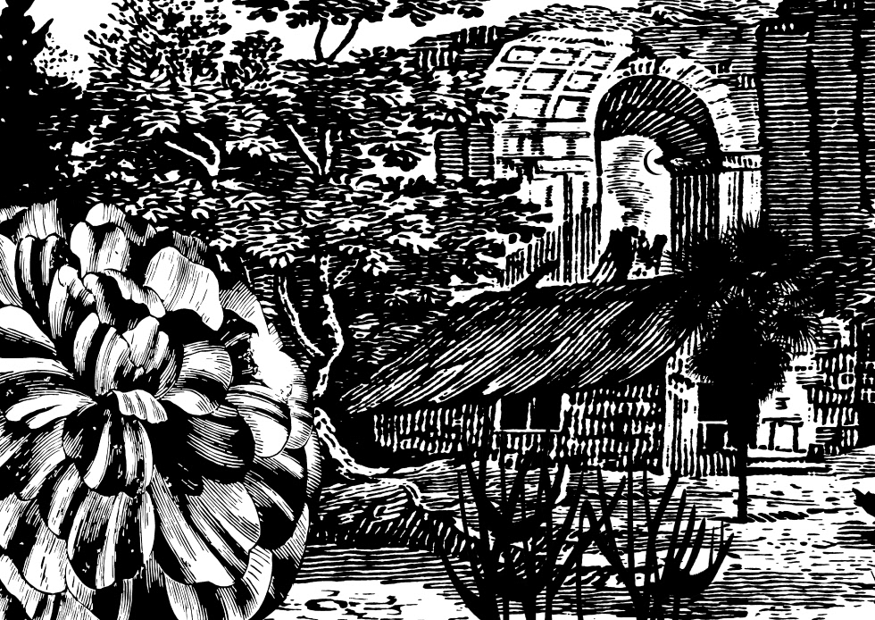
Working creatively within brand guidelines highly considered typography rests within a balanced grid structure to communicate clearly. Printed black over white, a champagne silver foil is used for the title. The image divides neatly into three and is used on the front of the A5 invitation cards creating a series.